
Manchester

I enjoyed the recent trip to Manchester and the places we visited once there because it broadened my thoughts I guess to the wider world or design studios and how they sit within a big city such as Manchester.

I feel that Manchester is a very design led city in that everything has a strong and successful design quota that is met throughout the city, compared to my local city centre; Hanley where branding, advertising and signage seem second rate as opposed to the Manchester approach that I felt gave off the impression that if it is designed well it will communicate equally as well, ensuring a successful design process.

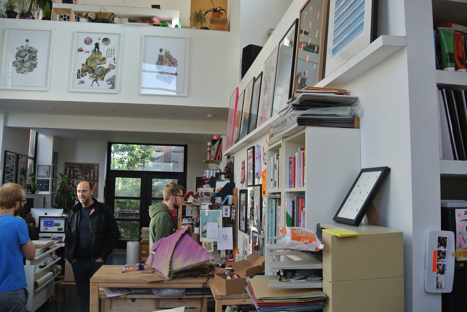
When we visited Textbook Studio in Islington Mill, I was amazed to see such an array of work spread out across every surface of the three storey studio space, each area had a distinct feel, clearly reflective of the artist or designer that worked in the associated space and the uniqueness of each piece of design work produced.


Comments

Popular posts from this blog

Virgin Atlantic Safety Video

This video caught my attention on a recent holiday aboard a Virgin Atlantic flight to Florida, the video is displayed before the flight and aims to deliver the essential safety information through an engaging and unique style. A story plays out throughout the short film, the use of animation engages you into the video and communicates the information to the viewer successfully. The company behind the project, Art & Graft created the initial ideas for the 6 minute film in just under 3 months. Considering throughout the process that the video must be able to stay on trend and current throughout it’s probably long tenure and diverse use throughout the Virgin Atlantic fleet.     https://youtu.be/8XNxZh9_YN0 Storyboard concept for the opening scenes.

EE Rebranding Process

UK mobile phone operators Orange and T-Mobile who merged to become Everything Everywhere, later simplified their name to EE. As of 2016, EE is soaring in profits, seeing a 10% increase to over £6.5bn in revenue in the three years from 2010 to 2013. More recently EE was purchased by the UK communication giant British Telecom Group more commonly known as BT. The success of EE’s new status as a highly successful mobile phone operator is underpinned by that of their successful rebranding strategy. This sentence itself is a relative contradiction as from the two years that followed from 2010, when Orange and T-Mobile merged the company traded under the brand name ‘Everything Everywhere’ this didn’t appear to catch on, rollout of this brand was slow, and to many people Orange and T-Mobile were trading exactly as they always have. Small trial concept Everything Everywhere stores were launched and the predicted feedback came back that the company was struggling to get the new bran...

City of Las Vegas Logo

The new City of Las Vegas Government logo in my opinion is there in thought and concept but the end result isn't as great as it should be. The typography is in keeping with the clear 1960's Googie style they were aiming for but through the bad stroke on the V and the strange arrangement of lettering specifically the last S is odd and seems a little rushed. The original logo was far more appropriate to what I would think of as more the corporate professional logo for the Las Vegas Government and I feel that the other is just trying to make the brand feel more youthful and modern but isn't quite successful. For this visual identity, we choose the font Big Noodle Titling for the “CITY OF” type because of its wonderful clarity in any medium. Big Noodle captures an industrial feel with a modern, progressive flair that is perfectly timeless. The “Las Vegas” type originated from the font, Stay High by Syed Faraz Ahmed. We transformed each letter to embody the mood and sty...